It’s been a while since we released the openEHR Toolkit and we have a lot of new users (luckily it’s been very active).
We have a bunch of tools to be added from our TODO list and since we are going to add more and more tools, the current GUI might not be optimized for all these tools.
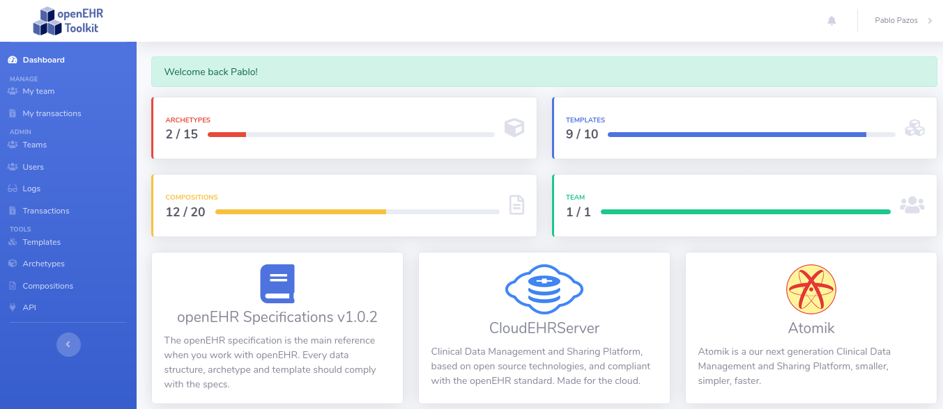
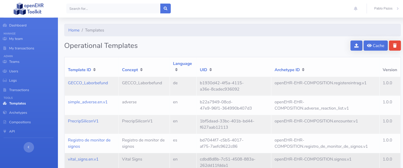
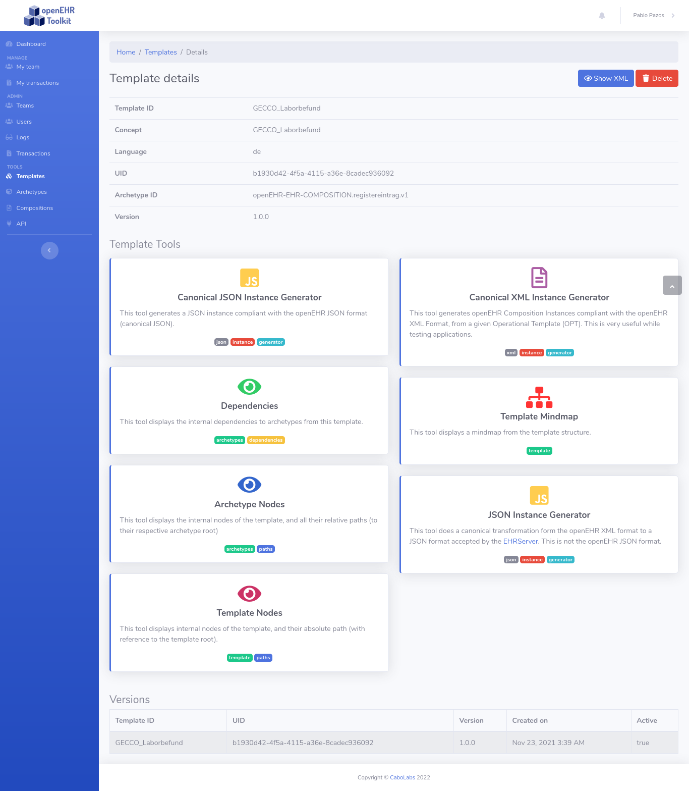
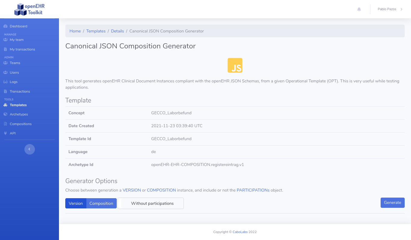
The current GUI is based on a normal admin layout, text menu on the left dividing the app sections, then a set of tools inside each section. Here just a sample flow:
- dashboard
- templates
- template details (tools are displayed as big cards with description, etc.)
- JSON instance generation tool
Then for reference, this is a flow in the CKM.
- dashboard
- archetype details
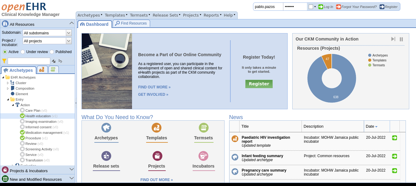
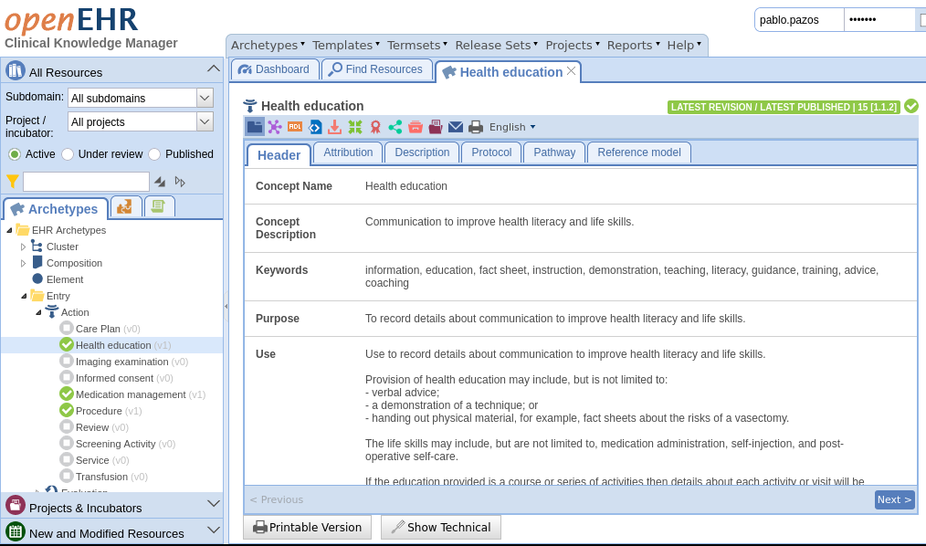
You can see on the CKM the sections are in a top horizontal menu organizing drop down menus when clicked, then tabs to organize the main “content” area, and then the “tools” are organized in a horizontal menu just with icons (no text or description). This kind of design is more like a technical app than an admin portal like the layout we have in the openEHR Toolkit.
I would like to know your opinion on having a top menu with the sections and small icon buttons for the tools. Is that something you would prefer to the current design? For sure it will help accommodate more tools easily, though it lacks description on the tools, so it’s like an expert user tool. Maybe we can design something in the middle of the “expert” and the “novice” too.
If you have any suggestions, I would love to hear them, especially if you are actually using the toolkit.
Thanks a lot!
Pablo.