That’s really interesting, Olly - thanks for the comments. I was trying to stick closely to the format of the equivalent pages from the old website, but you’re right: we could make a lot more of the applications, rather than focus on the vendors/ developers themselves.
Got to give some thought to how best to display that info… I like the idea of the tiles definitely, but I don’t want as many categories as there are apps… please do send over what you’ve got.
Also, how do we incorporate the other tools and products? Platforms, libraries etc… ![]()
The update is definitely a still work in progress, so I’m very much open to ideas like this. Drop me a DM and we’ll have a chat. P
I don’t think we need to show exact proportions in terms of ethnicity, but the Asian photos were prominent in the new site, and most were also together. That is where I think showing more diversity might be better. Also the age range in the photos is pretty narrow. I think we have people from 20+ to 60+ (and maybe more) in our community, so why not showing that in the photos?
Either way, I don’t personally like stock photos because it’s pretty obvious those are models and note real doctors, nurses, students or informaticians in the openEHR world.
2 Likes
In the old site, the underling data was all entered (or at least enterable) by the vendors themselves - do we have this capability with the new site?
In previous sites (i.e. before django) I used to try to keep it up to date. Nearly impossible!
Well, the community is as ‘diverse’ as the societies from which it comes, and the subgroups in those societies who are in medicine, standards, HIT etc. Diversity is an output variable, not an input - I don’t think we should care about it, since it’s not for anyone to control (other than potentially growing the community say further eastward, or Africa, which would be nice of course - already quite a footprint in India!).
I do think the website should reflect (roughly) the community that exists in reality, ideally with photos of real people, not stock photos. A narrow set of ages / sex/ ethnic group does tend to make a visitor imagine that the organisation is specific to some geography or social group that is not the case. My first impression was Asian gamers ![]()
I don’t really care about diversity of innate qualities (i.e. everything is fine) - diversity of professions, clinicians, stakeholder types is more interesting to represent.
1 Like
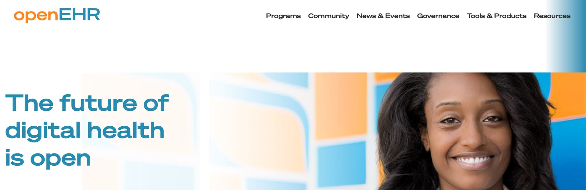
First, congratulations on the new website. I think it really emphasizes the openEHR colors and the brand! Overall, it looks fresh and modern.
At the same time, I agree with Pablo that it’s a bit too many stock photos. Maybe the carousel can be put more prominently and you can ensure there is always some nice photos from real people, e.g. from events like in Reading or Berlin.
Also a minor comment: “Join the Club” sounds a bit too informal to me as especially newbies can get even more confused what openEHR is about.
Another thing: the margin between the menu and the first section appears to be a bit too large, but this could also be just my subjective opinion and the transition could be smoother (see the blue stripe on the right, looks like a hard break when it reaches the section)
2 Likes
The page for Archetype Designer is not available:
The page you are looking for does not exist, or it has been moved. Please try searching using the form below.
On my Android phone, the menu in the top right corner doesn’t seem to work when tapped (FireFox browser v115.2.1). In other words, the menu doesn’t show up at all when tapped on the ToC button.

While on my PC desktop (win10+Chrome), when resizing the browser window to my phone screen ratio, the menu is ok (it can be displayed normally).
Thanks Forest. I’ve fixed the link and I’ll check out the menu - I’m on Android myself and haven’t noticed a problem, but I’ll see what can be done. P
2 Likes
FYI, exactly, the OS is Xiaomi HyperOS.
And the Archetype Designer - Online page is up now. Thanks, @Pete_Bouvier
2 Likes
Thanks for the feedback, Birger. I’m glad you like the new design.
I’ll make a few changes this morning: you’re right about ‘Join the club’ - too exclusive perhaps - and I’ll see if I can fix the gap.
As for the stock images, it would be good to replace them with some quality photos of real openEHR people - something I’ll look into!
P
2 Likes
We can definitely agree on this!
In most cases it’s a combination. Homogeneity in any community tends to be self-reinforcing, for this reason amongst others:
IMO both are important. There are heaps of examples that tech developed by homogeneous groups, whether regarding innate qualities or otherwise, unintentionally introduce bias which makes it unusable or even dangerous for people outside the developer demographic.
3 Likes
Clip arts other than photos?
Certainly true. That’s always a failure of requirements and scope understanding. But plenty of counter-examples as well. We always need to think / travel outside our own boxes to do the best work.
3 Likes
HiGHmed has had a professional photographers at some events so that may be one source.
Screenshots from youtube videos by Sidhart and others are also a nice source. For example 5:40 -7:05 in: https://youtu.be/ShCzrHlzmHo where Dr. Ramesh & Dr. Poornachandra talk about big EHR systems

5 Likes
how about sourcing images from actual users, so its free PR of the users as well as satisfying the requirement of new images?
I mean, the users can volunteer and probably approach the ones who have adopted the system for a period of time
2 Likes
Glad you said that Pete, as was going to say the same, should do away with all stock images of humans, very 2007 ! ![]()
1 Like
To be fair to @Pete_Bouvier (and speaking as the one who created or managed all prior versions of the website) , stock images is usually where you have to start. In the early days, the only way I had to avoid them was to use ‘interesting’ but completely non-health images, e.g. the flying birds that some here will remember.
So anyone who can supply royalty-free ‘real’ images of people and places (maybe something from Karolinska, or some of Sidharth’s work locations?) - you need to step up and actually provide something!
2 Likes
Can you some description of what you’re looking for? I might be able to check it out
Totally appreciate what you’re saying, and good to meet you Thomas. So many generic photos of doctors and patients in healthcare / health tech websites for the very reason you state.
Like Erik said, there’s lots of event photos that could be used and stills from youtube videos etc. But happy users would be icing on the cake! ![]()
1 Like
@Pete_Bouvier Right now it looks to me like the site is entirely down? (502 error)
1 Like