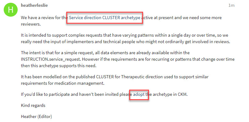
I’ve just added this topic and included a couple of hyperlinks (outlined in red) in the screenshot but even though I know they are there, I can barely discern them. I suspect others will not notice the link. Can hyper links be made more obvious please?
2 Likes
Yep, I also think this is a problem. It may be a theme thing. @marcusbaw - any idea how we change choices to do with fonts, links etc?
Ok I found it - I have made links a lighter blue. For me it is definitely better - but everyone has different colour perception!
1 Like
Colour palette changes are at https://discourse.openehr.org/admin/customize/colors
(Worth remembering that if we have more than one ‘Theme’ https://discourse.openehr.org/admin/customize/themes/4 then users can choose which they prefer, on a per-user basis. At present there is only one active theme, hence users don’t get a choice. We could make some variations on the standard theme we have here, which would be user-selectable.)
1 Like
I have tweaked the blue colour a little and it looks reasonably ok on my monitor @heather.leslie - can you take a look ?
as in https?/openehr.org
Arrgh - sorry @thomas.beale - I just realised you had already tweaked it. It looks better to me now but 
Bah, need a minimum of 20 characters, so I can’t just say ‘perfect’!
This is another thing. I sort of understand the reason behind this minimum limit, but it can be really annoying too. Especially when you just want to thank someone. Can we do anything about it?
Now 20 for first post for user. 10 after that
1 Like
OK so, being a smart ars, I tried to send “Perrrrfect” only to be given the message:
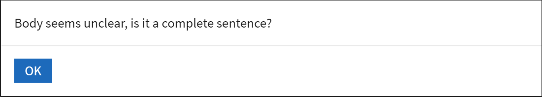
It won’t let me send 
And suggests I should just ‘like’ your comment instead!
1 Like
That’s actually not a bad suggestion. If a “like” is sufficient to say “thanks” or “great”, other people won’t get spammed as much.
2 Likes