We have been trying to find out more about use of this score, and how it is practically implemented - do others have any experience? In particular we are not clear about what data is actually recorded.
We have been trying to find out more about use of this score, and how it is practically implemented - do others have any experience? In particular we are not clear about what data is actually recorded.
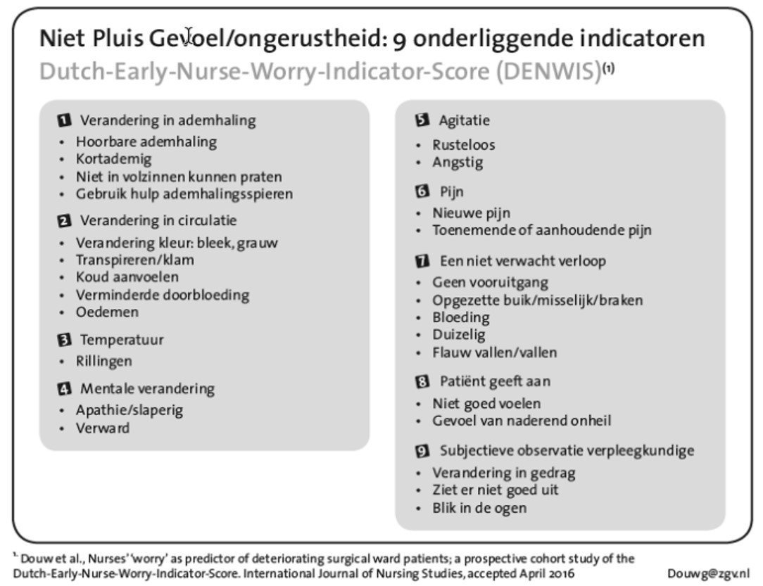
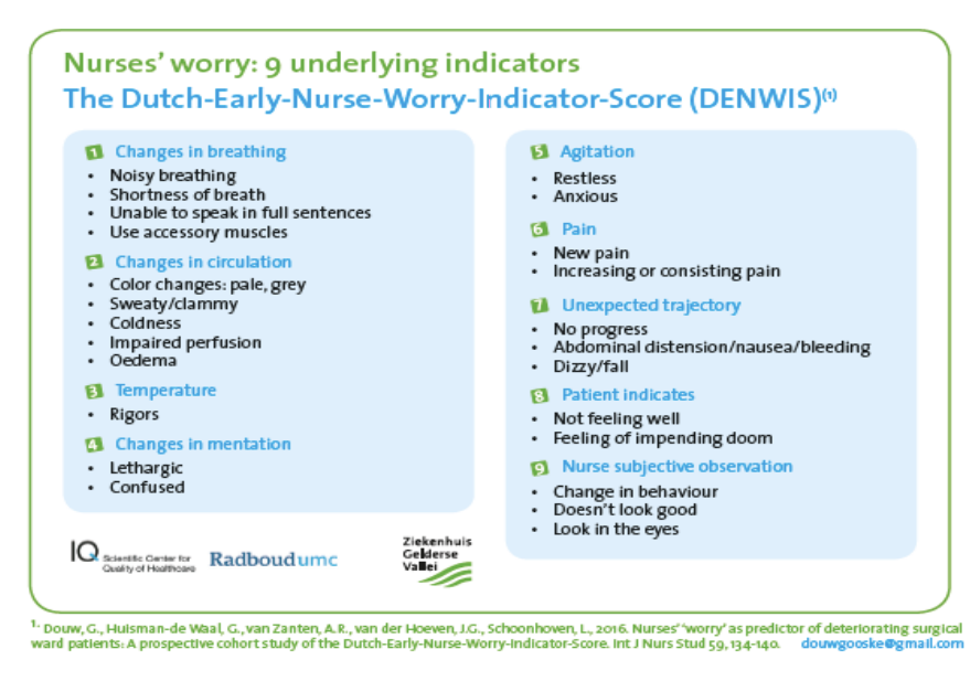
This seems to be designed as part of a PhD thesis of Gooske Douw:
Seems to be indicators that can either be present or not present. This is very much an instrument used in hospital settings only, it seems. However it is not well explained in that thesis. Perhaps ask the author?
Thanks Pieter,
This
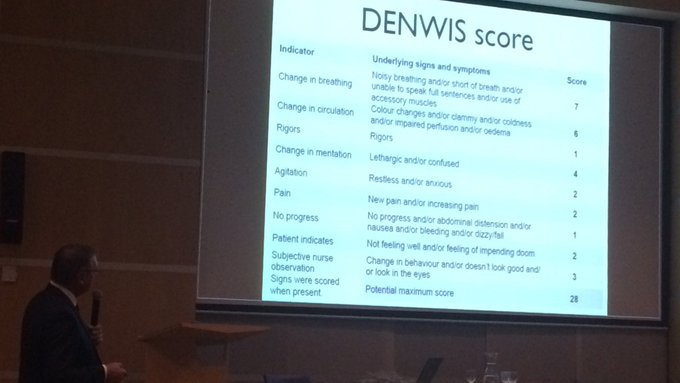
There is an example of actual scoring via Google image search
but from the PhD paper…
"The DENWIS was incorporated into the electronic nursing files. After thorough instruction
and training, nurses scored worry (yes or no) and DENWIS signs (when present) once per
eight-hour shift or at the moment they felt worried about the patients’ condition. Vital signs
were measured three times a day, once in every shift. When vital signs were stable,
frequency decreased to once or twice a day. With increasing EWS values, the frequency of
measurements increased to every two hours for an EWS from five to seven, and every hour
for an EWS of seven and higher. We considered vital signs to be normal when they were
measured once a day.
which suggests recording a 0:1 score for each ‘heading’ and the specific indicators for each heading which resulted in a positive score.
Take-home message - any guideline or PhD paper which is intended to be implemented electronically should have an informatics adviser (just as important as a statistician).
I would say not only those instruments intended to be implemented electronically - for basic reproducibility I would say any instrument developed as part of a study should be properly documented.
I think the problem Ian highlights is endemic. Templates or pro-forma documents are frequently created in paper without significant consideration to the atomic data that makes up compound clinical concepts on a page.
It’s not surprising the authors have implemented it in their local EPR but it is accepted that observations are poorly represented in electronic format. The work I am involved in is based on building a system around the red thread of patient organ function. I think the granularity of data collected in this score - even for a maximal one is quite limited.
While the score inherently provides a controlled vocab for each organ / system / category it might be best to let the recorded use free text to justify their worry assessment.
On another note this is very similar to a clinical ABCDE assessment that requires an impression of organ function & clinical signs.
I’m unfamiliar with this exact scoring system. But I once prepared a presentation about early warning scales related to sepsis with a focus on surgical patients. So I might help out. But The resolution of the image is too bad to read it.
Without reading the whole thesis (sorry), my question would be whether the score has been validated clinically (assume it has) and on what sample size. How does it compare to conventional EWS - accepting that comparisons between scoring systems are difficult, due to lack of denominator.
It seems to favour natural language/subjective assessments over more objective measures like vital signs.
P.S. Sandy, you stole my Twitter handle 
Id like to look in to this the coming week.
Btw: In case you weren’t sure: The second image seems like a literal translation from the first image.
I’ve had a go at creating an archetype and template for this https://ckm.apperta.org/ckm/templates/1051.57.221 - it would be great to get your comments and feedback